Thursday, May 16, 2013

Social Injustice Project: Power of One Movie Poster


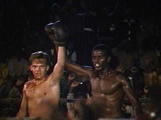
For this project I created a movie poster based on the movie and book The Power of One. I took several images from the movie and arranged and placed them underneath a stencil created from the image of the number one. Using the real movie's cover as a reference, I added the major actors' names, the quote, and the title using the text tool. I'm not a huge fan of the novel or the movie, but I found this project to be rather enjoyable. Next year I hope other students will choose to do this project, or create a movie poster for a film of their own choosing. 

Images found from: 


Monday, May 13, 2013

Color Wheel Projects


For this first project I designed it based on the covers of the Professor Layton game series, using key objects from each game as the stencil and the cover of each game (with the exception of The Eternal Diva, which is a movie).  After creating the stencils and applying them to the image I colored them by using a photofilter, but the color still felt too weak so I used to color replacement tool as well and gave each stenciled image an outer glow for even more impact against the stark black background. To complete this project, I decided to put the iconic Professor Layton logo in the center and arrange the images around it.


The second project was created using the same method except this time using my own silhouettes and bits of the background from the stencil as the actual image. I created this background using the gradient tool and an inner glow effect on the individual images as well as an outer glow effect.  Layout was especially difficult with this project because I loved all my image but they all looked best in the same section of the project, which would be too crowded. So I tried to still maintain balance while keeping all my images as close to where I originally wanted them as possible.

Thursday, April 18, 2013

Digital Photography at the MET: Reflection

Source: http://www.metmuseum.org/exhibitions/view?exhibitionId=%7b2E988323-B8DF-496F-B72A-E999E567FABA%7d&oid=190056911&pg=2&rpp=20&pos=36&ft=*
This is an Untitled work done by Anderson and Low in 2009, but with a print date of 2012. I really love this image because it looks like something straight out of a hyper-realistic anime or manga. I've really loved reading Japanese comics and watching the animations since middle school. Manga and Anime are actually a big part of what inspired me to start drawing in the first place, so similar projects always have a soft spot in my heart.

The photographer's most recent  project Manga Dreams actually involved working with teens and young adults to create similar portraits based on the stylized characteristics of manga and anime.

Tuesday, April 16, 2013

Authentic Project

For this project we were assigned to create an image using nothing but our own original photos and drawings.


This project was inspired by one of my friends who got me into the A Series of Unfortunate Events books, which features the evil Count Olaf as it's main villan who happens to have a  tattoo of an eye on his ankle. The friend that introduced me to the series often wears the outrageous and awesome high heels, which inspired me to draw her with the VFD eye tattoo.

First I sketched out the basic outline, then went back to add the color and color effects, and then finally I made the background using some of the more unusual brushes in very large sizes and added in the caption.


My other project was inspired by this photo I've often used before, but I decided to doodle a menagerie of things that were important or relevant to me and my imagination, using the same process as before. 

Thursday, March 14, 2013

Batesville Day T-Shirt Design

My submission for the Batesville Day T-shirt contest was inspired by the apple butter the area is known for. I picked an image of a jar and adjusted the threshold to give the splotchy black and white look. Then I went back in with the text tool and added in the label and other text. 

Tuesday, February 26, 2013

Typeface Project


For this project I went out and took pictures of my hands making different letters (this required a little practice with the self timer on the digital camera). Then, I brought all the images into photoshop and desaturated them. Then I went back with the history brush to color back in the areas that made up the letter so the letter would stand out more from the background and the rest of the hands. Then I went into each image and selected the area around the letter formed and put that in its own layer. This way the letter was the center of the image and much bigger and more noticeable. Finally, I arranged them all as 2x2 in squares with the help of the ruler tool and voila.

Tuesday, February 19, 2013

Chair Project


For the first image I took samples of past projects of my own and dragged them onto the same canvas as the chair. I turned down the opacity of all layers, except the chair layer. so I could see the contours of the chair which I would have to warp the other images to fit. Using the warp tool I adjusted each image to fit the body of the chair, then went back using the dodge and burn tools to create highlights and shadows. Then I created a shadow for the chair by using the drop shadow effect and played around with the settings until I found I shadow I liked. Finally, I re adjusted the opacity of all the layers and voila. 

I think this chair turned out okay overall, I felt obligated to use multiple projects in the chair for some reason, but I would have much rather just used one. I think the multiple images made it look too much like a patchwork quilt.


I followed the same process for this chair, only I left the opacity a little on the light side, because it made the Peanuts comic strips feel more vintage and faded. Unlike the first chair, the images here seem to flow together more nicely so it doesn't feel as "patchwork-y". This time I added in a floor and wall also using the warp tool to adjust these. It was really difficult to even get it to look vaguely realistic. The shadow also ended up being a bit of a mess, but overall I'm pretty proud of it.

Thursday, February 7, 2013

Comic Project


So this project was inspired by my friends who taught me how to play this weird card game called Mao. The rule seems pretty simple at first: "The only rule I can tell you is this one." but it quickly gets pretty complicated. The game basically functions like Uno, but with some other odd rules thrown in. For example, there can be verbal cues you have to say, or actions you have to perform when you put down a certain type of card. Every round the winner gets to add in a new rule, but doesn't tell anyone what it is. Weird and frustrating as this game can be, I always have a good time. 

Unfortunately,  the idea of having a good time did not apply to the process of making this project. I had the (what I thought was a) brillant idea to draw my comic out by hand from scratch, since that's a hobby of mine anyway. I felt like I was wrestling with this project tooth and nail the whole way. Nothing seemed to want to go right, and granted that it's hard to color on a tablet you're not used to, by the end I was so frustrated with myself I had considered throwing something across the room a couple of times. 

But that's just how some things are sometimes, luckily, I did manage to finish and now I can move onto to something new. 

Tuesday, January 15, 2013

Midterm Project


Rather than use several images, I chose to take one huge image and break it down into little 1in x 1in boxes, each on their own layer. To keep myself from getting confused (because that's over 35 layers already) I labeled each row with a letter and each column with a number so I knew exactly what each square was of and where it was located. I tried to keep most of the big changes on the inside of the flower and outside surrounding it, because I wanted to keep the petals looking like, well petals.

Overall, I was going for something that would comprised of 35 completely unique squares but formed something unified and recognizable; much like how people are. They're made of all these interesting different sides and little quirks that form together to make one personality. I'm very pleased with the end result and enjoyed this project.
 

Thursday, December 20, 2012

NAAP Project II: Dream World


This project, like the first, was created from following a tutorial from Photoshop User Magazine. The images used were available for download through the website for NAAP members and the moon was found though a google image search for "public domain moon".

The tutorial for this one was much more open ended than the one for the first project. Instead of saying set this to specifically this number, it said to mess around with the settings until it looked something like this. It also did a better job of explaining why certain tools were used and what they controlled. However, sometimes the lack of detailed instruction made it impossible for me to nicely replicate the effect from the example image and I ended up having to leave out certain parts entirely. For example, the lighting and shadows are off, and the example image had smoke trailing out of the chimneys, but I couldn't get mine to look right so I left it out.

I learned quite a bit from both of these tutorials, despite my frustrations, and I'm very proud of both resulting images.

NAAP Project I: Hunger Games District Seal


For this project I followed a tutorial in Photoshop User Magazine. The base images were available to NAAP members for personal use through their website. From there I followed the instructions step by step until I got the final product. The tutorial was very guided and told you exactly what colors and settings to use, which I appreciated. The tools mostly involved adding special effects like inner glow, drop shadow, and embossing and messing around with channels and paths in addition to layers. However, it didn't really explain why you made certain changes or what certain tools did. I got an awesome result but it felt more like a science than an art. Of course I got an excellent image in the end, I followed the directions and put all the right stuff in, so the right result came out. By the end I had figured out on a basic level what some of the tools did, which was interesting because I'd never have figured that out on my own, but it didn't feel like I really created this piece. All the hard work was done for me, I just went through the motions.


Thursday, December 6, 2012

Advertisement


Image Sources:

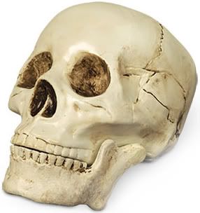
Skull:http://i160.photobucket.com/albums/t166/thegreatgallina/Poor_Yorick_Skull_Shakespeare_Hallo.jpg
Stage: http://appsummer.org/sites/appsummer.org/files/media-resource/stage-w-chair.jpg
Collar Ruff:http://www.wyrdrune.com/Costume/index.html?ruff/index.html~right

This event I am personally involved with, so I thought it would be fun to make an advertisement for it. Myself, and several other of my theatre friends will be competing by performing a Shakespearian monologue that is 20 lines or shorter, which isn't very much in terms of Shakespeare, so a lot relies on being able to put a lot of emotion into the performance instead of letting the language carry it. 


Thursday, November 29, 2012

Kaleidoscope Project

This project required the use of a photoshop tutorial found on youtube. The tutorial was simple and easy to follow; understanding the directions was easy. Following them on the other hand, was much more difficult with one step in particular. When it came to skewing my rectangular selection I could not get it at a perfect 45 degree angle to save my life. It just would not give me the option no matter what I did! I was about to fling the entire keyboard across the room in frustration. So in the end, I gave up and made it as close as I could.

For the first project like this, I had to use an original photo, which was difficult because all my photos were of people and people don't typically work well when creating kaleidoscopes. So I used a small section of an arm crossed over a shoe that wasn't easily identifiable so it would look more abstract. 

The second project I used a picture of a mask. I loved this image so much I actually made two colleges using different sections of the image. The bright colors and patterns really caught my eye and they melded together seamlessly when the image was completed. They're currently some of my favorite images I've created so far. 

All in all, this project was frustrating, but the effect I got out of some of the projects was well worth it. 

Before:


After:


Before:

After:


After:


Thursday, November 15, 2012

Photo-Editing Sites Review

Taaz.com:

This site allows you to do a complete virtual makeover on a model, or even someone in a photo of your own. Taaz is fun if you want to play around with different colors and makeup tools to see how they'll look on you, without you actually having to buy them. It's relatively simple to use; the most difficult aspect is getting a good photo. It has to be a headshot style of pretty high quality in order for the selections you make to look accurate. This site works by having you select different parts of the face upon the site's direction so it knows where to apply a certain effect. This site exclusively deals with hair and makeup, so it's obviously not as complete as photoshop, but would be useful for touching-up makeup, a common use for photoshop. This site is mostly targeted towards girls roughly in their teens and twenties. Although it's uses are fairly limited, it does a good job of doing what it does.


Aviary.com: 

Aviary.com allows you to make basic changes to a photo; it's much less extensive than photoshop, but it's simplicity works to its advantage. Photoshop can be daunting, and it can take hours to watch all the tutorials you might need and even longer to figure out the tools on your own, but Aviary makes it easy. The basic changes that most people would use photoshop for like: getting rid of red eye, changing the lighting, covering a blemish, etc. are included and all you have to do it select a change, it will be displayed on the photo as a preview from which you can choose to alter the change or apply it. Aviary seems to be targeted at teens and preteens because its very user-friendly and bright.

I chose to play around with the demo which automatically gives you this default image:

And this was the result after I had made some changes:

Pixlr.com

Pixlr has several different levels of complexity when it comes to editing. The simplest is the Pixlr-O-Matic (which was what I chose to make my example below). This allows you to do basic cropping and add filters which change the light and give the image a cool vintage effect. Pixlr Express gives you a few more options and ability to tweak the presets from the Pixlr-O-Matic, this is a little more complicated than Aviary, but still very understandable. Finally, the Pixlr Editor is more like a mini version of photoshop. Pixlr so far has been my favorite because it offers these three different levels of difficulty than can be used by people who have both very little experience in digital editing and those that have lots more. This would be my choice to link on the webpage.

Before:

After:

Citrify.com:

Citrify is best described as a mini photoshop directed at teenagers. It's bright design is easy on the eyes and it explains what some of the adjustments do when you hover your mouse over the option. It doesn't give you a whole lot of explanation or hold your hand while guiding you through the editing process, but that allows for some freedom and creativity. Basically. Cirtrify could be the "training wheels" before Photoshop because it is set up in a very similar way, but is aimed to get beginners used to the names and tools that are available when it comes to digital editing and isn't as overwhelming as Photoshop.


Before:

After:

Monday, November 12, 2012

Inside Out Project: Faceless


My idea for this project was inspired by this one song that I was listening to while brainstorming; the song is "Faceless" by RED, and I included some of the lyrics on the left. I've always really been drawn to masks in general, but it wasn't until I heard this song and saw a similar political cartoon that I had the idea for making someone faceless underneath the mask.

First I began looking at pictures of masks, I wanted one that was smiling, but slightly creepy, so a harlequin mask seemed perfect. The mask needed to actually be potraying an expression because I wanted it to contrast with the face (or lack thereof) underneath.Then I searched for a headshot of someone in black and white photography. Once I found the two images I wanted to use, I layered them on top of each other, cutting around the mask and re-sizing it to get it to be proportionate to the actual face. Then, I went back to the image underneath and used the smudge tool to slowly get rid of the eyes, mouth, and nose by scooting the skin color around over it. This was very time consuming and often frustrating, but the result was worth it. Finally, I added in the lyrics with the text tool, and voila~


Thursday, November 8, 2012

"Marla" Abstract Work: Abstractions


This project was short and easy, I created an abstract work by playing around with different brushes, colors, opacities, and flow in photoshop while listening to music. The brush strokes tended to vary depending on the song I was listening to. For example, I used the red while listening to an alternative rock song and softer purple strokes while listening to a softer folk song.

Thursday, October 25, 2012

Theatre in a Nutshell: Word Cloud


This was created by using a website called Wordle. Wordle allows you to make really cool word clouds  by simply typing in a group of words, then you can change the color, orientation, and arrangement of the words to your liking.

The one I made was inspired by theatre, and all the crazy objects and things that become part of your common vernacular once you've been in it for awhile.

Self Portraits


This project was to create an image using 9 3x3 in pictures of me and adding a colorful border that is representative of you. I had several pictures that I really liked and turned out well because all but one was taken with a pro-quality camera so I used 5 different images instead of just one or two.

After choosing the pictures I wanted to use, I dragged them into photoshop and set up a ruler and a grid so I could scale them down correctly. I played around with arrangements of the photo order until I found one I liked. I wanted the picture in the center to be the only image there weren't two of and made sure two of the same images weren't right next to each other.

Then, I began looking at different filters I could use. Most were pretty subtle (ex. accented edges) , but I chose a couple of more abstract one like Note Paper. My main goal with filters was to emphasize the face, not obstruct it, since that's what a self portrait is supposed to be anyway.

Finally, I found an image of a board display someone had decorated in a cute and quirky way, used the color replacement tool to make it appear mostly blue (leaving it all pink didn't look very good with the colors in the photos I used), but left some pink in there on purpose, and used that as my border.  I chose it because I really like things that look old fashioned, but are very classy and quirky. I tend to dress and act in that style so I thought it was very fitting.

I really enjoyed this project because it was fun to be able to portray and express myself in a new and interesting way. I think this work really expresses my personality as a whole and I really can't think of anything I'd want to change.