Tuesday, February 26, 2013
Typeface Project
For this project I went out and took pictures of my hands making different letters (this required a little practice with the self timer on the digital camera). Then, I brought all the images into photoshop and desaturated them. Then I went back with the history brush to color back in the areas that made up the letter so the letter would stand out more from the background and the rest of the hands. Then I went into each image and selected the area around the letter formed and put that in its own layer. This way the letter was the center of the image and much bigger and more noticeable. Finally, I arranged them all as 2x2 in squares with the help of the ruler tool and voila.
Tuesday, February 19, 2013
Chair Project
For the first image I took samples of past projects of my own and dragged them onto the same canvas as the chair. I turned down the opacity of all layers, except the chair layer. so I could see the contours of the chair which I would have to warp the other images to fit. Using the warp tool I adjusted each image to fit the body of the chair, then went back using the dodge and burn tools to create highlights and shadows. Then I created a shadow for the chair by using the drop shadow effect and played around with the settings until I found I shadow I liked. Finally, I re adjusted the opacity of all the layers and voila.
I think this chair turned out okay overall, I felt obligated to use multiple projects in the chair for some reason, but I would have much rather just used one. I think the multiple images made it look too much like a patchwork quilt.
I followed the same process for this chair, only I left the opacity a little on the light side, because it made the Peanuts comic strips feel more vintage and faded. Unlike the first chair, the images here seem to flow together more nicely so it doesn't feel as "patchwork-y". This time I added in a floor and wall also using the warp tool to adjust these. It was really difficult to even get it to look vaguely realistic. The shadow also ended up being a bit of a mess, but overall I'm pretty proud of it.
Thursday, February 7, 2013
Comic Project
So this project was inspired by my friends who taught me how to play this weird card game called Mao. The rule seems pretty simple at first: "The only rule I can tell you is this one." but it quickly gets pretty complicated. The game basically functions like Uno, but with some other odd rules thrown in. For example, there can be verbal cues you have to say, or actions you have to perform when you put down a certain type of card. Every round the winner gets to add in a new rule, but doesn't tell anyone what it is. Weird and frustrating as this game can be, I always have a good time.
Unfortunately, the idea of having a good time did not apply to the process of making this project. I had the (what I thought was a) brillant idea to draw my comic out by hand from scratch, since that's a hobby of mine anyway. I felt like I was wrestling with this project tooth and nail the whole way. Nothing seemed to want to go right, and granted that it's hard to color on a tablet you're not used to, by the end I was so frustrated with myself I had considered throwing something across the room a couple of times.
But that's just how some things are sometimes, luckily, I did manage to finish and now I can move onto to something new.
Tuesday, January 15, 2013
Midterm Project
Rather than use several images, I chose to take one huge image and break it down into little 1in x 1in boxes, each on their own layer. To keep myself from getting confused (because that's over 35 layers already) I labeled each row with a letter and each column with a number so I knew exactly what each square was of and where it was located. I tried to keep most of the big changes on the inside of the flower and outside surrounding it, because I wanted to keep the petals looking like, well petals.
Overall, I was going for something that would comprised of 35 completely unique squares but formed something unified and recognizable; much like how people are. They're made of all these interesting different sides and little quirks that form together to make one personality. I'm very pleased with the end result and enjoyed this project.
Thursday, December 20, 2012
NAAP Project II: Dream World
This project, like the first, was created from following a tutorial from Photoshop User Magazine. The images used were available for download through the website for NAAP members and the moon was found though a google image search for "public domain moon".
The tutorial for this one was much more open ended than the one for the first project. Instead of saying set this to specifically this number, it said to mess around with the settings until it looked something like this. It also did a better job of explaining why certain tools were used and what they controlled. However, sometimes the lack of detailed instruction made it impossible for me to nicely replicate the effect from the example image and I ended up having to leave out certain parts entirely. For example, the lighting and shadows are off, and the example image had smoke trailing out of the chimneys, but I couldn't get mine to look right so I left it out.
I learned quite a bit from both of these tutorials, despite my frustrations, and I'm very proud of both resulting images.
NAAP Project I: Hunger Games District Seal
For this project I followed a tutorial in Photoshop User Magazine. The base images were available to NAAP members for personal use through their website. From there I followed the instructions step by step until I got the final product. The tutorial was very guided and told you exactly what colors and settings to use, which I appreciated. The tools mostly involved adding special effects like inner glow, drop shadow, and embossing and messing around with channels and paths in addition to layers. However, it didn't really explain why you made certain changes or what certain tools did. I got an awesome result but it felt more like a science than an art. Of course I got an excellent image in the end, I followed the directions and put all the right stuff in, so the right result came out. By the end I had figured out on a basic level what some of the tools did, which was interesting because I'd never have figured that out on my own, but it didn't feel like I really created this piece. All the hard work was done for me, I just went through the motions.
Thursday, December 6, 2012
Advertisement
Image Sources:
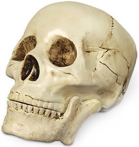
Skull:http://i160.photobucket.com/albums/t166/thegreatgallina/Poor_Yorick_Skull_Shakespeare_Hallo.jpg
Stage: http://appsummer.org/sites/appsummer.org/files/media-resource/stage-w-chair.jpg
Collar Ruff:http://www.wyrdrune.com/Costume/index.html?ruff/index.html~right
Subscribe to:
Posts (Atom)