Thursday, May 16, 2013

Social Injustice Project: Power of One Movie Poster


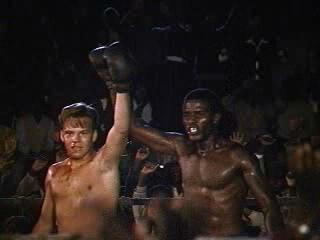
For this project I created a movie poster based on the movie and book The Power of One. I took several images from the movie and arranged and placed them underneath a stencil created from the image of the number one. Using the real movie's cover as a reference, I added the major actors' names, the quote, and the title using the text tool. I'm not a huge fan of the novel or the movie, but I found this project to be rather enjoyable. Next year I hope other students will choose to do this project, or create a movie poster for a film of their own choosing. 

Images found from: 


Monday, May 13, 2013

Color Wheel Projects


For this first project I designed it based on the covers of the Professor Layton game series, using key objects from each game as the stencil and the cover of each game (with the exception of The Eternal Diva, which is a movie).  After creating the stencils and applying them to the image I colored them by using a photofilter, but the color still felt too weak so I used to color replacement tool as well and gave each stenciled image an outer glow for even more impact against the stark black background. To complete this project, I decided to put the iconic Professor Layton logo in the center and arrange the images around it.


The second project was created using the same method except this time using my own silhouettes and bits of the background from the stencil as the actual image. I created this background using the gradient tool and an inner glow effect on the individual images as well as an outer glow effect.  Layout was especially difficult with this project because I loved all my image but they all looked best in the same section of the project, which would be too crowded. So I tried to still maintain balance while keeping all my images as close to where I originally wanted them as possible.

Thursday, April 18, 2013

Digital Photography at the MET: Reflection

Source: http://www.metmuseum.org/exhibitions/view?exhibitionId=%7b2E988323-B8DF-496F-B72A-E999E567FABA%7d&oid=190056911&pg=2&rpp=20&pos=36&ft=*
This is an Untitled work done by Anderson and Low in 2009, but with a print date of 2012. I really love this image because it looks like something straight out of a hyper-realistic anime or manga. I've really loved reading Japanese comics and watching the animations since middle school. Manga and Anime are actually a big part of what inspired me to start drawing in the first place, so similar projects always have a soft spot in my heart.

The photographer's most recent  project Manga Dreams actually involved working with teens and young adults to create similar portraits based on the stylized characteristics of manga and anime.

Tuesday, April 16, 2013

Authentic Project

For this project we were assigned to create an image using nothing but our own original photos and drawings.


This project was inspired by one of my friends who got me into the A Series of Unfortunate Events books, which features the evil Count Olaf as it's main villan who happens to have a  tattoo of an eye on his ankle. The friend that introduced me to the series often wears the outrageous and awesome high heels, which inspired me to draw her with the VFD eye tattoo.

First I sketched out the basic outline, then went back to add the color and color effects, and then finally I made the background using some of the more unusual brushes in very large sizes and added in the caption.


My other project was inspired by this photo I've often used before, but I decided to doodle a menagerie of things that were important or relevant to me and my imagination, using the same process as before. 

Thursday, March 14, 2013

Batesville Day T-Shirt Design

My submission for the Batesville Day T-shirt contest was inspired by the apple butter the area is known for. I picked an image of a jar and adjusted the threshold to give the splotchy black and white look. Then I went back in with the text tool and added in the label and other text. 

Tuesday, February 26, 2013

Typeface Project


For this project I went out and took pictures of my hands making different letters (this required a little practice with the self timer on the digital camera). Then, I brought all the images into photoshop and desaturated them. Then I went back with the history brush to color back in the areas that made up the letter so the letter would stand out more from the background and the rest of the hands. Then I went into each image and selected the area around the letter formed and put that in its own layer. This way the letter was the center of the image and much bigger and more noticeable. Finally, I arranged them all as 2x2 in squares with the help of the ruler tool and voila.

Tuesday, February 19, 2013

Chair Project


For the first image I took samples of past projects of my own and dragged them onto the same canvas as the chair. I turned down the opacity of all layers, except the chair layer. so I could see the contours of the chair which I would have to warp the other images to fit. Using the warp tool I adjusted each image to fit the body of the chair, then went back using the dodge and burn tools to create highlights and shadows. Then I created a shadow for the chair by using the drop shadow effect and played around with the settings until I found I shadow I liked. Finally, I re adjusted the opacity of all the layers and voila. 

I think this chair turned out okay overall, I felt obligated to use multiple projects in the chair for some reason, but I would have much rather just used one. I think the multiple images made it look too much like a patchwork quilt.


I followed the same process for this chair, only I left the opacity a little on the light side, because it made the Peanuts comic strips feel more vintage and faded. Unlike the first chair, the images here seem to flow together more nicely so it doesn't feel as "patchwork-y". This time I added in a floor and wall also using the warp tool to adjust these. It was really difficult to even get it to look vaguely realistic. The shadow also ended up being a bit of a mess, but overall I'm pretty proud of it.